Have you ever been immediately drawn to a certain color or completely turned off by a specific hue?
It happens all the time. We aren’t always aware of why but we have these positive and negative feelings toward a given color.
When it comes to branding, color plays a crucial role.
- 84.7% of consumers cite color as the primary reason they buy a particular product.
- 80% think color increases brand recognition.
- Colored ads are read 42% more often than black-and-white ads
So you can see why choosing the right personal branding colors can strengthen your message and public image.
Color Psychology for Your Brand
Color psychology explores how color impacts human behavior and perception.
Studies suggest that people make subconscious judgments about a product within 90 seconds of first seeing it. Researchers also found that between 62% and 90% of this quick assessment is based on color alone.
These powerful subconscious reactions are essential to personal brand colors.
As part of your brand identity, every color choice either reinforces your brand or sends a mixed message to your audience. Understanding color associations is crucial to maximizing the power of your visual communication.
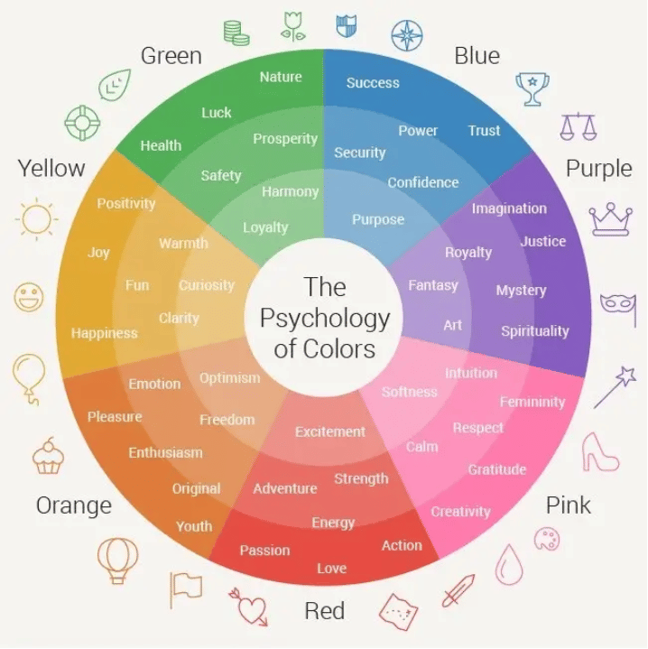
Color psychology explores the associations, symbols, and meanings that each color carries, making it a powerful tool for branding.
Here are the most common color associations in Western culture:

Source: Wordstream
Personal Brand Colors: Meanings and Associations
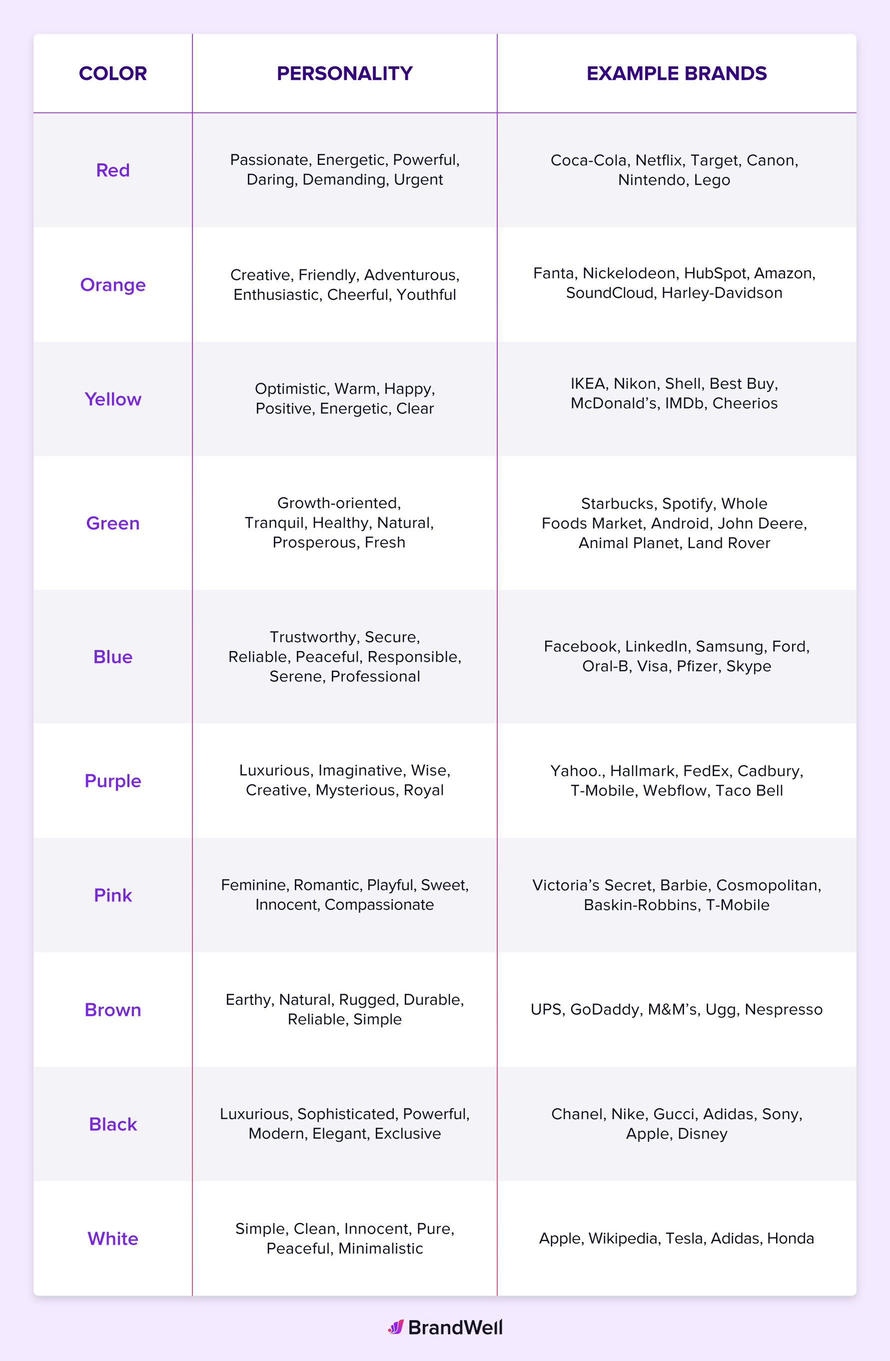
Choosing the right colors is just as important as selecting the right font. Every color comes loaded with symbolism. Aligning these pre-existing ideas about each shade with your unique brand values will only serve to strengthen your image.
Before exploring some brand color ideas, think about which three words best describe your personality and personal brand. These might include trustworthy, bold, confident, approachable, innovative, motivational, powerful, experienced, creative, wise, intelligent, creative, cutting-edge, grounded, fun, or simple.
Once you’ve identified these brand adjectives, review the common color associations below to explore some possible matches for your personal brand colors.

Once you have identified a single primary color that feels like a good match for your top personal brand qualities, you’re ready to create a color palette.
Your color preferences and how you want your target audience to feel when interacting with your brand is important. For example, bright red evokes strong emotions, but a softer shade like navy blue might suit a more traditional brand.
Building a Winning Color Palette
Of course, using just one color for all your branding can start to feel flat. Think about building out your brand color scheme to create a palette that represents you in a dynamic and memorable way. Based on the color wheel below, there are three ways you can build a color palette for your brand.

1. Monochromatic Color Scheme
This color palette utilizes various tints, tones, and shades of the same color to provide variations. Think about what a branding photoshoot would look like if you were to only use one color family.
Consider the personal brand of Monika Normand, a professional photographer, educator, and entrepreneur. Her photography and branding frequently use neutrals, but the focus remains on showcasing depth through various tones of rust.
See this color palette concept in action with the various websites, social media feeds, and print designs from Monika Normand Photography.
2. Analogous Color Scheme
Analogous color schemes use two to five colors that sit side-by-side on the color wheel to create visual harmony. Here at BrandWell, we use this approach to great effect. We rely primarily on purple, a shade strongly associated with imagination and ambition — great values to convey to attract future-thinking users.
Our palette consists of neon purple and red against a black backdrop. You’ll see variations on this palette across our website and branding.

For your media posts, you want to use your colors consistently across all media platforms. Your website and social media accounts should reflect the same color scheme.
3. Complementary Color Scheme
If you want an eye-catching combination with plenty of pop, explore a complementary scheme featuring colors from opposite sides of the color wheel. When paired together, these shades really grab the eye and amplify each hue’s effect.
For example, Burger King makes great use of a complementary color scheme: blue, red, and yellow. They have incorporated a bright blue accent color in their logo and branding.

What’s notable is that their main competitor, McDonalds, leans on a very different feeling palette, relying heavily on red and yellow — two shades believed to trigger appetite. Burger King, though using similar hues, strategically selects an electric shade of blue as their core color to differentiate themselves within the industry.
Why Your Personal Brand Colors Matter
Selecting your personal branding colors may seem insignificant compared with your value proposition or content strategy. However, it’s important to remember that color matters. The colors you use to express yourself will determine what people take away from their initial interaction with your personal brand.
Selecting personal brand colors that work harmoniously is worth your time.
For example, take a look at companies like Starbucks, FedEx, Target, Apple, or Google. The impact these choices have on brand strength and recognizability is undeniable.
Consider adding your colors to things like your email signature and website design. If your budget allows, hiring a qualified and experienced brand designer or brand strategist will always yield optimal results when exploring personal brand color options.
Conclusion
Choosing brand colors can be a real challenge, especially if you don’t consider yourself particularly creative.
It’s easy to fall into the trap of picking colors you personally like. For example, if green is your favorite color, you might instinctively choose it for your brand.
But don’t make that mistake.
It’s not about your personal preferences — it’s about what will attract your ideal customer.
For example, would a bold lime green suit a prestigious content-writing brand? Should a marketing agency targeting children’s brands opt for a deep, serious black?
They could, but it would overlook the importance of color psychology and what resonates with their audience. And that might hurt them down the line.
So before you settle for your favorite color, take the time to think strategically. It may take more than a day, but it’s worth the investment!


